
My commute to and from work each day consists of a train and subway ride, as well as about 1/2 a mile of walking. This time is when I get most of my reading, writing, and thinking done. Unsurprisingly, given how much time I spend missing trains and held up walking at red lights, my thoughts often turn to the walk or ride itself.
Let’s consider one part of my commute: the walk from the PATH station to the office. This walk is about 5 blocks or so on the New York grid, passing through a traffic light at each intersection. Plotted with one dimension of space and one of time, it might look like this:
![]()
In this plot, time progresses from left to right, and my walk will take me from the top of the plot (the train station) to the bottom (the office). Each red light along the way is indicated as a red line (green lights are left blank for clarity – they would fill the blank spaces between each red dash).
Let’s say I leave the train station at a particular time near the left side of the graph and start walking:
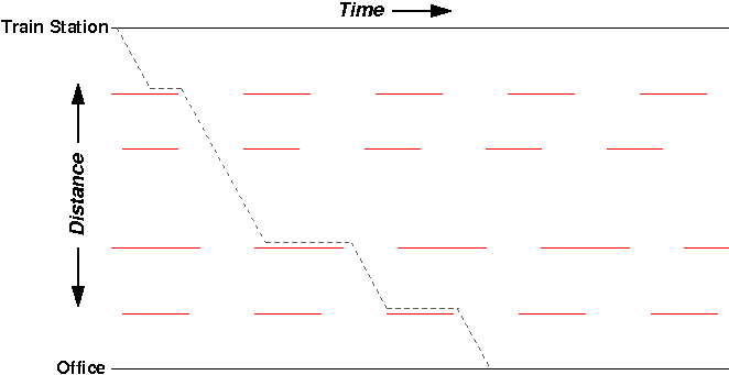
Assuming I walk at a constant speed, my path while walking looks like a diagonal line through time and space. When I get held up at a red light, my path goes horizontal (I’m standing still in space, but still progressing through time). Overall, this gives my path a bit of a zig-zag pattern in the 1-D space + time plot.
Now, on the same morning, let’s say I leave the PATH station minute or two later (maybe the train was delayed a bit, or I exited from the back of the train instead of the front):

Once again, my zig-zag path takes me to the office, stopping at the red lights along the way. But interestingly, despite leaving later from the train station, I arrive at the office at exactly the same time:

In both routes, despite stopping at different lights early on my journey, I still get caught at that same last red light. It didn’t matter that I started earlier or later – the outcome was the same.
Now, we plot all of the possible starting times and their resulting walks:
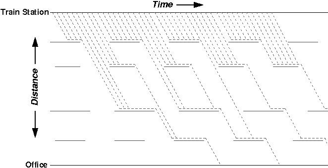
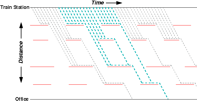
Interestingly, despite dozens of possible starting times at the train station, there are only a few possible times of arrival at the office. In effect, the red lights “collapse” the outcomes into a smaller set. For example, the 18 different starting times highlighted in the figure below all have the same result:
Another interesting set of paths to look at are the “tipping points” – any pair of neighboring paths with different arrival times:
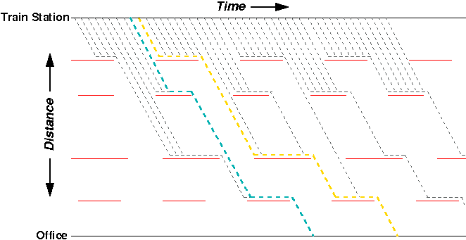
Here, a difference of a few seconds in starting time between the blue and yellow paths means many minutes of delay on the arrival side. Also notable is that the blue path is one of the shortest, with respect to total time, whereas the gold path is one of the longest.
Next time: how I think these paths relate to chaos theory and strange attractors…
(Inspired by Ybry’s visualizations of train schedules, from Edward Tufte’s book Envisioning Information.)